
Tales of woe: the cost of a botched rebrand
What makes people wait in line for days to get their hands on the latest iteration of a phone series or a pair of neon sneakers? Is it the quality and hype of the product, the need to convey a certain image or pure loyalty? Well, it is all these and a whole lot more since the Intellectual Property (IP) underpinning all brands drives our emotions as strongly as it does sales.
Customers look for brands that offer a unique and reliable solution, something that reflects their aspirations and speaks to them on a personal level. With proper handling and a little luck, good branding can skyrocket a company's market value and turn a customer base into a fanbase. But achieving – and maintaining – that level of positive exposure is tricky. And just as rebranding can bring about a revitalizing facelift and an influx of followers, it can also lead to embarrassing financial disaster.
A melting pot of ingredients
Branding is the net result of combining elements such as logos, slogans and color schemes to give a product, service or organization its distinct look and set it apart from competitors. It also includes delivering key messages that convey core principles, special qualities and the customer experience. This more active side of branding often involves marketing tactics such as product placement, pricing strategies and online campaigns to help build a consistent image across multiple channels.
A successful campaign focuses on this customer journey when creating a brand identity. Invariably, this means understanding how users interact with the products or services and identifying where there are opportunities to improve. By supplying the idea of a personalized encounter across all touchpoints – from website design to advertising – businesses can build customer trust and foster an unforgettable brand image that demands repeat encounters.
Cooking up a rebrand
As is to be expected, rebranding is the transformation of any or all of these elements to create a new image that reflects a business's growth and evolution. With so many components at play, this is a deceptively complex process that requires careful consideration of different internal and external factors. A rebranded product or service can refresh the interaction with current customers and help win over new ones. On the other hand, if poorly judged or mishandled, a rebranding exercise can rock the boat, tossing dedicated users overboard and leaving a once-steady brand floundering.
We all make mistakes, even businesses stocked with professionals at the top of their game. But the bigger the company, the bigger the mess when things go wrong. An overdone rebrand can linger in consumer memory for a long time.
There is no single recipe for the ideal rebrand, as any campaign is entirely specific to the original brand: its market position, public relations standing, objectives and so on. However, as mentioned, any organization needs to recognize where it is in the competitive environment, where it wants to go and why. As we shall see, the cost of a misstep is often much greater than falling flat on one's face.
The ups and downs of Weight Watchers
Weight Watchers began in the early '60s when founder Jean Nidetch invited friends to her house to share the struggles of losing weight. Together, they found there was more to their ambition than simply counting calories, encompassing many mental and emotional health aspects. Through weekly meetings and peer support, they helped each other achieve their goals, and soon the program had grown into an international phenomenon. In 1998, Weight Watchers introduced its first numerical system that evaluated food based on its nutritional content to tremendous success – even registering a trademark for "Points" and receiving numerous patent grants. All seemed to be on the up and up as waistlines shrank. Fast forward to 2018, when the company unveiled an unexpected new logo and branding strategy emphasizing "Wellness That Works" rather than weight loss.
The move was met with surprise and criticism, as many customers felt it did not accurately reflect their values or needs. First, the name "WW" – which supposedly stood for nothing at all – was considered too generic and broad, cold and "corporate." The vagueness of the branding did not give enough indication as to who their target audience was supposed to be, making it difficult for potential customers to identify whether it was a suitable program for them. Plus, the adoption of a somewhat more feminine brand identity initially alienated some men from the scheme, while a perceived attempt to euphemize dieting implied a certain stigma.
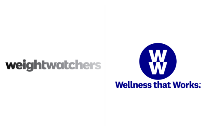
In 2018, Weight Watchers muddled their brand image by implying their simplified "WW" logo stood for "Wellness that Works." The resulting bemusement and disaffection among customers led to the removal of the tagline soon after. A hard lesson in staying on message. (Image sources: 1000 Logos and Logos-World.net)
The low-calorie icing on the cake was that the move away from its core message – weight loss – caused confusion among existing customers about the company's true purpose. The effect was a drop of 600,000 subscribers in six months, a downturn in Q4 earnings and a catastrophic 34% nosedive in stock valuation. With its mission to shed pounds, not dollars, the company eventually reverted to its classic branding together with a modified "WW" logo after realizing the new look had puzzled and distanced customers.
Closing a Gap in the market
There is wisdom to be found in the adage: "If it ain't broke, don't fix it." And when it comes to brands, nowhere does this ring more true than in the case of clothing retailer Gap. The popular fixture of shopping districts tried to give its brand an edgier look via a redesign in 2010, inadvertently creating one of the most universally hated logos ever due to its dated appearance and lack of character or personality. In addition to displeasing customers, the new logo received terrible publicity from professional designers for its bland font choice and antiquated composition. Many argued that it failed to capitalize on the strong brand identity that Gap had cultivated for decades through its attractive trademarks. With a reported $100 million invested, the rebranding effort went to Helvetica in a handbasket, leading to significant financial and image loss for the company and causing its stock prices to drop sharply soon after the announcement.

From fashionable to farcical and back again in the space of a week. In hindsight, the clothing retailer's short-lived 2010 redesign was more "Stop, Gap!" than "stopgap." The takeaway: There is no accounting for taste. (Image sources: 1000 Logos)
Other problems arose from changing its advertising strategy too quickly as part of the rebranding initiative. Shifting away from its traditional focus on celebrity endorsements, Gap debuted a series of ill-received campaigns featuring everyday people. These issues only compounded Gap's troubles, and the company was forced to abandon the reviled logo after only six days due to public outcry.
PepsiCo: when creative juices run dry
Finally, there is Pepsi and its notorious logo redesign. In 2008, the company spent a reported $1 million for a new logo featuring bolder colors, a sans-serif typeface and a dark blue circle for an outline. The public's reaction to this change was overwhelmingly disdainful, with people pointing out its lack of creativity and deriding it as unoriginal and unimaginative. Designers were also highly critical of the new look, saying it would do little to differentiate Pepsi from other brands.
To make matters worse, when the purported design document behind it all surfaced, its bizarre comparisons of the Pepsi logo to magnetic fields, the golden ratio and the expansion of the universe turned dismissal into open mockery. Capping off this bubbling concoction of branding gone sour, Peter Arnell – the artist behind the redesign – used harsh words to characterize his work on the project, scoffing, "It's all bulls––t. A logo on a can of soda? Please."
The campaign was right on one thing, however, its title: "Breathtaking."
Pepsi's logo redesign was a success in the sense that the resulting trademark was the face of a brand valued at $13.7 billion USD in 2021. However, if the alleged design document is to be believed, this outcome was more by luck than judgment. (Image credits: goldennumber.net)
But this story has not yet gone flat for parent company PepsiCo. Through his "brand architecture" company, the Arnell Group, the ever-effervescent man who ate 50 oranges a day was also commissioned to redesign Tropicana's packaging. Despite his penchant for citrus fruit, this other attempt to rebrand was met with calamity. The juice brand swapped its iconic cartoon-style orange with a straw for a minimalist white label featuring a glass of orange juice with the words "Tropicana Pure Premium" written vertically.
The move was widely panned, with consumers failing to locate the brand in supermarket aisles and writing negative reviews about the new packaging. Despite Tropicana's efforts to explain that their product had not changed, customers were not buying it. Sales dropped by 20%, forcing the company to reverse course and return to its original design within a few months.
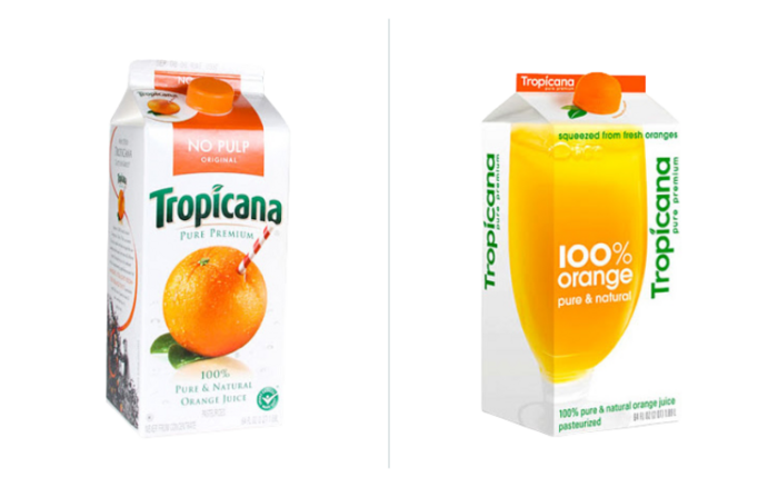
Tropicana was less fortunate than its fellow PepsiCo brand, being mistaken for budget store-brand juice. Rebranded cartons sat on shelves as regular customers were unable to pick out their preferred drink easily. A bitter reminder to choose external partners carefully. (Image source: The Branding Journal)
Rebranding is more than just changing a logo, slogan or other front-facing IP; it is about rethinking the entire business image and creating an appropriate emotional connection with customers through marketing and trademarked elements. The process should always be approached strategically, with research at its heart. Companies need to pay attention to customer feedback and preferences while staying true to their product's identity as they re-imagine it, or else risk alienating loyal customers or confusing potential ones. No small feat, but as we shall see in an upcoming blog, the rewards of getting it right can be game-changing.
If you are considering a rebranding campaign, the trademark experts at Dennemyer can ensure that your all-important refreshed IP is protected everywhere you need it to be.
Filed in

Dennemeyer's legal experts and services recognized for global excellence.

10 years on from the Brexit vote
How far will the United Kingdom diverge from EU law and practice for trademarks and other IP rights?

IP FAQ: Which trademark symbol should I use?
What the "TM" and circled "R" symbols mean, and why businesses need them.

Ambush marketing and major sports events
What might seem like bold and opportunistic advertising at the Olympics or World Cup can actually damage organizers, sponsors and the public.
WTR 1000: Global acclaim for Dennemeyer in 2026
Dennemeyer's legal experts and services recognized for global excellence.
Get the updates in your inbox
Subscribe to get the latest news and updates.
No spam. We promise.